Data Exploration
Our goal here is to examine some factors in our dataset and see if we can visualize some of the relationships between variables. We will be using a dataset taken from the kaggle website. See here for the source
The Dataset
From below output we can see the dataset has 11 columns 6 being features of the game such as platform or genre and 5 being sales figures.
import pandas as pd
df = pd.read_csv('https://github.com/Aidzillafont/Video-Games-/blob/843e8c4c47db94fc39b083f82226d4b88c8924a1/vgsales.csv?raw=true')
df.dtypes
Rank              int64
Name             object
Platform         object
Year            float64
Genre            object
Publisher        object
NA_Sales        float64
EU_Sales        float64
JP_Sales        float64
Other_Sales     float64
Global_Sales    float64
dtype: object
Visualizations
Lets check the genres and see how genres rank on global sales
#lets check the best selling genre of all time
best_genre_df = df.iloc[:,4:].groupby(['Genre']).sum().sort_values(['Global_Sales'], ascending=False)
best_genre_df
| NA_Sales | EU_Sales | JP_Sales | Other_Sales | Global_Sales | |
|---|---|---|---|---|---|
| Genre | |||||
| Action | 877.83 | 525.00 | 159.95 | 187.38 | 1751.18 |
| Sports | 683.35 | 376.85 | 135.37 | 134.97 | 1330.93 |
| Shooter | 582.60 | 313.27 | 38.28 | 102.69 | 1037.37 |
| Role-Playing | 327.28 | 188.06 | 352.31 | 59.61 | 927.37 |
| Platform | 447.05 | 201.63 | 130.77 | 51.59 | 831.37 |
| Misc | 410.24 | 215.98 | 107.76 | 75.32 | 809.96 |
| Racing | 359.42 | 238.39 | 56.69 | 77.27 | 732.04 |
| Fighting | 223.59 | 101.32 | 87.35 | 36.68 | 448.91 |
| Simulation | 183.31 | 113.38 | 63.70 | 31.52 | 392.20 |
| Puzzle | 123.78 | 50.78 | 57.31 | 12.55 | 244.95 |
| Adventure | 105.80 | 64.13 | 52.07 | 16.81 | 239.04 |
| Strategy | 68.70 | 45.34 | 49.46 | 11.36 | 175.12 |
Here we can see that Action sells the most and Strategy sells the least. Lets visualize this
import plotly.express as px

fig = px.bar(best_genre_df,  x=['NA_Sales',	'EU_Sales',	'JP_Sales',	'Other_Sales'], y=best_genre_df.index, title="Best Genre by Sales", text_auto=True, width=1250)
#to reverse order so action is at the top
fig.update_yaxes(autorange="reversed")
fig.show()
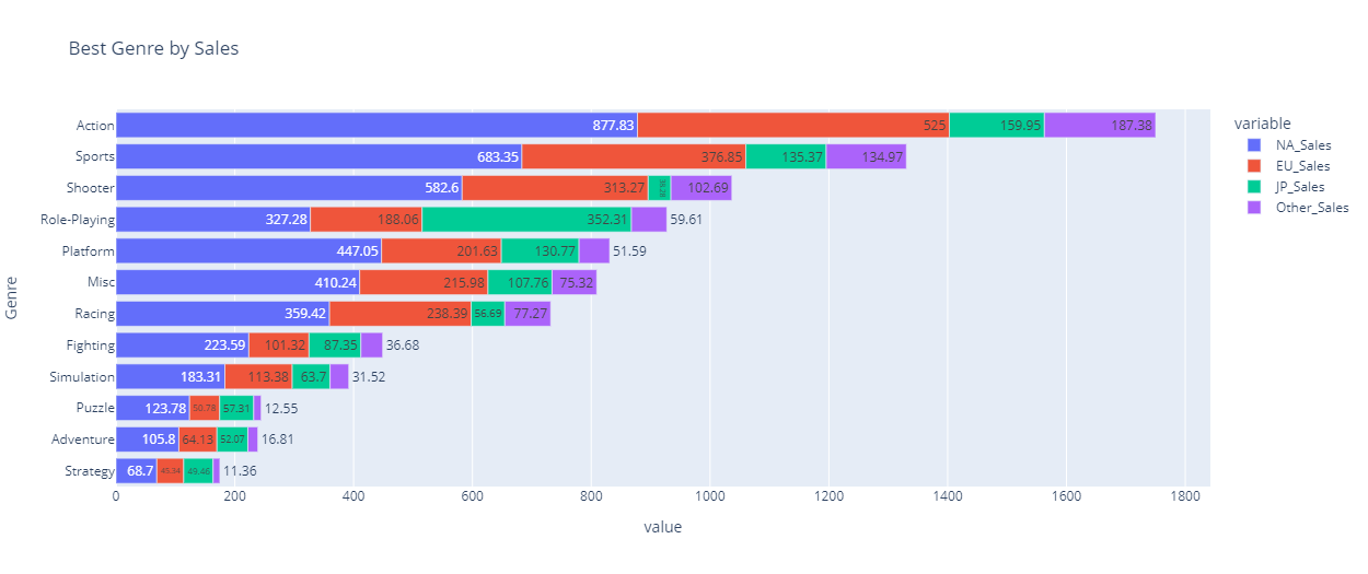
From the above visualization we can see not only the highest selling genre but how they sell in each region. Something to note here is North America is responsible for most sales in every genre bar Role-Playing. The best region to sell role playing is Japan according to the data.
So we know the best selling genre for games per region but what platforms have the most games? Are specific genres being targeted by specific platforms? We will look to answer these questions and more with some visualizations.
But first we are gonna need to construct a dataframe to examine this!
df_genre_by_platform = df[['Genre', 'Platform','Rank']].groupby(['Genre', 'Platform']).count()
#reseting the index here so we can use column names in our plotly sunburst
df_genre_by_platform.reset_index(inplace=True)
#rename rank to represent what it really is count of games on that platform
df_genre_by_platform.rename(columns={'Rank':'# of Games'}, inplace=True)

fig = px.sunburst(df_genre_by_platform, path=['Genre', 'Platform'], values='# of Games', width=500, title='Sunburst of Genres and Platforms # of games')
fig.show()

fig = px.sunburst(df_genre_by_platform, path=['Platform','Genre'], values='# of Games', width=500, title='Sunburst of Genres and Platforms by # of games')
fig.show()
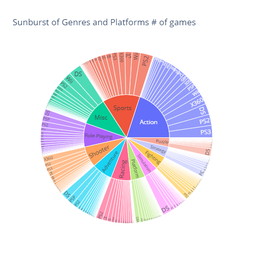
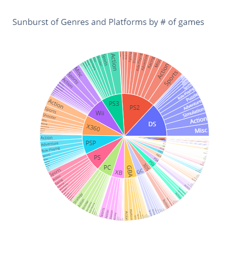
Oh no! This visualization looks a little squishy. Sunburst can be a great visualization tool but it has a downside being when you have too many categories then it becomes all squished together and loses some of its eligibility.
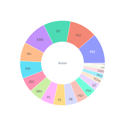
Fortunately for us plotly is interactive so if you check out my python notebook you can click into the graph yourself and zoom in to categories. If you clicked Action you would see something a little like this.
fig = px.sunburst(df_genre_by_platform[df_genre_by_platform['Genre']=='Action'], path=['Genre', 'Platform'], values='# of Games', width=500)
fig.show()
Lets try and get a less squishy view of everything by using a bubble chart. In the bubble chart below the size of the bubble is is gong to be the number of games on that platform genre pair.
fig = px.scatter(df_genre_by_platform, x='Platform', y='Genre',
	         size='# of Games', color='Platform', width=1500, title='Number of Games on Platform Genre Pairs')
#to reverse order so action is at the top
fig.update_yaxes(autorange="reversed")
fig.show()
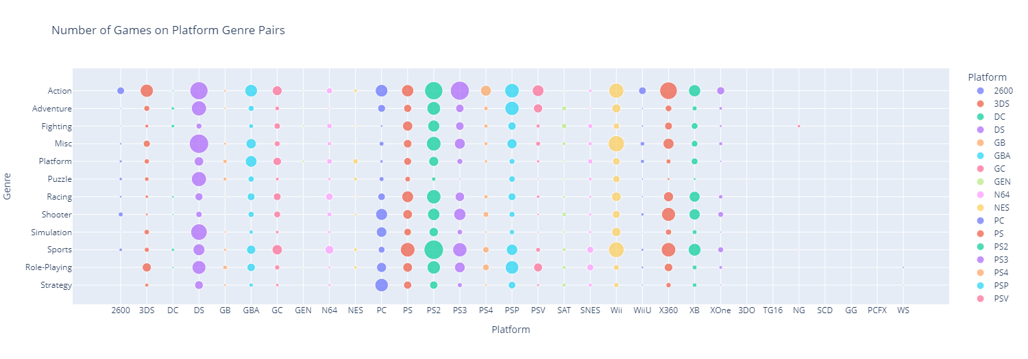
Cool so the bubble lays it out with more clarity but you lose proportionality that you with a sunburst or pie chart.
It is interesting to note here that there are some platforms where there really is not alot of games on for example the PCFX only has 1 game!
Its also worth noting that some platforms really don’t cater to some game genre for example all the playstation platforms don’t really have many puzzle games.
So with the combination of the bubble and sunburst we can see that most genres are dominates by only a handful of platforms and some platforms really have most of the games. Lets visualize that second part in a sunburst
From the above we can see nearly half of all games are on only 5 platforms.
So lets summarize what we have found:
- The best selling games are Action games
- Only 5 platforms account for half of all the games
- Those platforms being DS, PS2, PS3, Wii and X360
- Different platforms cater more to different genres
- for example DS has the most simulation, puzzle and misc games
This is for the number of games on platforms what about sales?
df_gp_sales = df[['Genre', 'Platform', 'Global_Sales']].groupby(['Genre', 'Platform']).sum()
#reseting the index here so we can use column names in our plotly sunburst
df_gp_sales.reset_index(inplace=True)

fig = px.sunburst(df_gp_sales, path=['Genre', 'Platform'], values='Global_Sales', width=500, title='Sunburst of Genres and Platforms by sales')
fig.show()

fig = px.sunburst(df_gp_sales, path=['Platform', 'Genre'], values='Global_Sales', width=500, title='Sunburst of Genres and Platforms by sales')
fig.show()
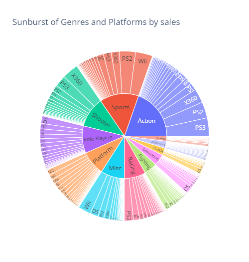
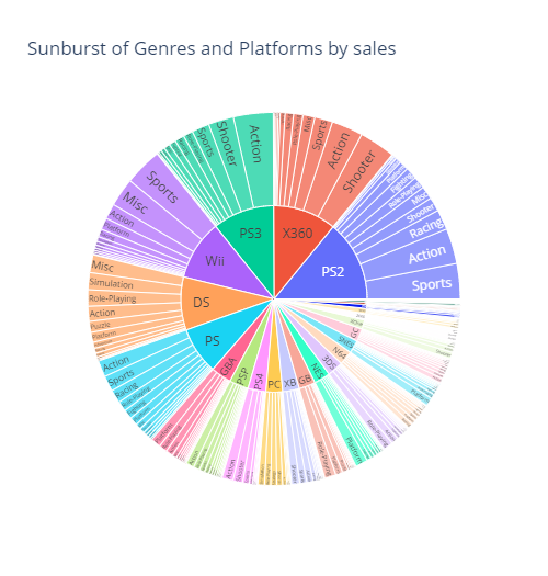
We can see from above similar patterns when compared to game count. This makes sense since generally if there are more games to be sold you would expect that there would be proportionally more games sold overall.
So if your a gamer who plays action games mainly you probably want to stick with playstation or xbox.
Lets look at how games sold at different genres over time and see if any genres are growing in popularity
#df_sale_over_time = df.gro
df_sale_over_time = df[['Genre', 'Year','Global_Sales']].groupby(['Genre', 'Year']).sum()
df_sale_over_time.reset_index(inplace=True)
df_sale_over_time = df_sale_over_time.sort_values(['Year'], ascending=(True))

fig = px.line(df_sale_over_time, x='Year', y='Global_Sales', color='Genre')
fig.show()
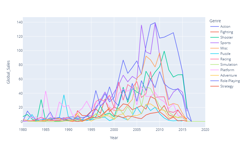
Whats this has there been a collapse in the gaming industry over the last decade. Well no its really just a result of data set not having a much games from later years. Lets check this out with out another line chart.
df_number_of_over_time = df[['Year','Global_Sales']].groupby(['Year']).count()
df_number_of_over_time.reset_index(inplace=True)
df_number_of_over_time.rename(columns={'Global_Sales':'# of Games'}, inplace=True)
df_number_of_over_time = df_number_of_over_time.sort_values(['Year'], ascending=(True))


fig = px.line(df_number_of_over_time, x='Year', y='# of Games')
fig.show()
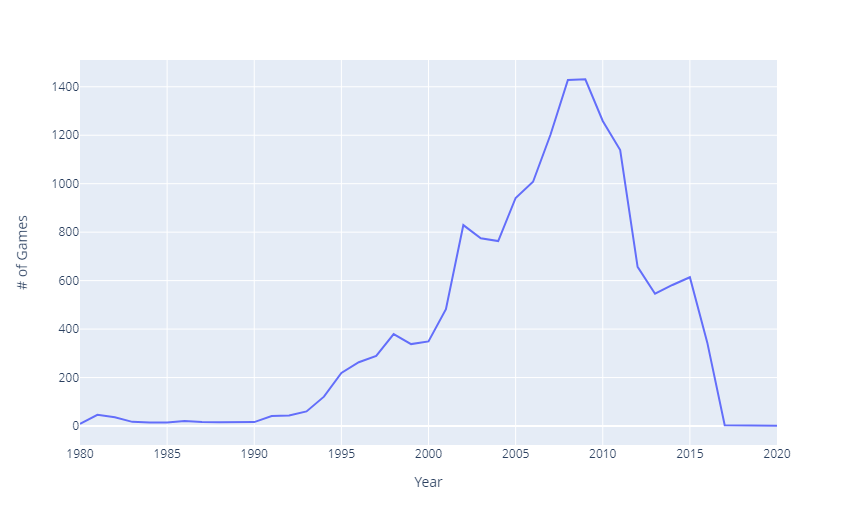
As can be seen here the data set seems to have reduced collection of data in the early 2000’s. I can say for certain 2017 onward is not a true picture of the gaming industry.
Our original line cart has a lot going on and is hard to parse visually so lets make a clear graph to show what genres sold more when
fig = px.bar(df_sale_over_time,  x='Year', y='Global_Sales', color='Genre', title="Best Genre by Sales over time",  width=1250)
fig.show()
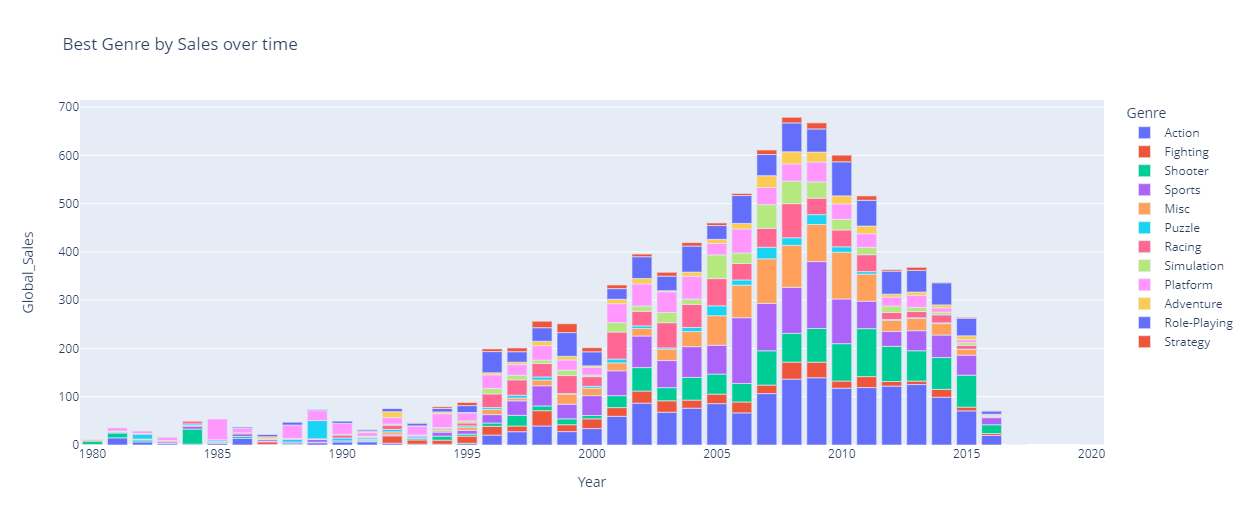
This is an improvement on line chart but lets make our y value a % of sales in a year so we can see what genres became popular in which years.
Below we use .transform() in pandas to divide the global sales figure by the sum of global sales in the given year and then store that number in ‘% of yearly sales’ to get our proportion
df_sale_over_time['% of yearly sales']=100*df_sale_over_time['Global_Sales']/df_sale_over_time.groupby(['Year'])['Global_Sales'].transform('sum')

fig = px.bar(df_sale_over_time,  x='Year', y='% of yearly sales', color='Genre', title="Best Genre by Sales over time",  width=1250)
fig.show()
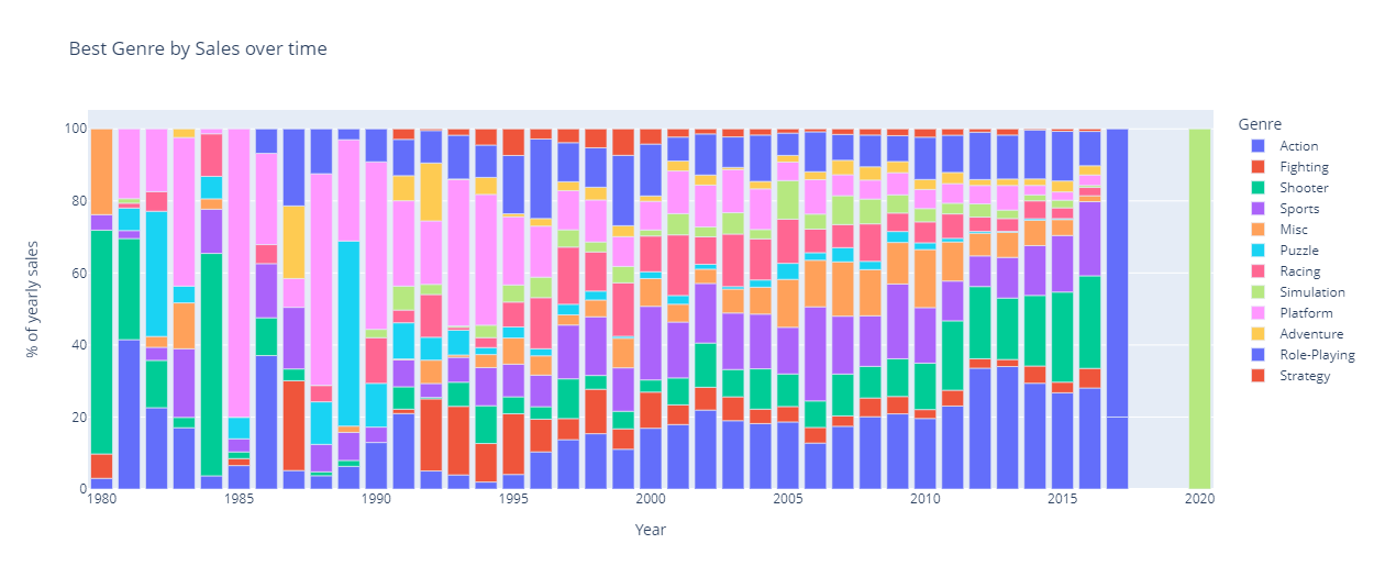
This more clearly shows the decline in the sale of puzzle games over the year and rise of popularity of action and shooter games in the 2000’s