The Data Set
The dataset for this exploration was taken from the popular website kaggle see source.
This data contains 5 features and 3 exam scores.
Features
| Name | Description | Type |
|---|---|---|
| gender | male or female | object |
| race/ethnicity | Groups A-E | object |
| parental level of education | how educated were the students parents | object |
| lunch | whether the student got a reduced or standard lunch | object |
| test preparation course | completed or none done at all | object |
Exam Scores
- math score (0-100)
- reading score (0-100)
- writing score (0-100)
The Goal
The goal of this exploration is to determine relationship of the features on the students performance. We will attempt to do this using some groupby aggregation in pandas and some visualizations using seaborn all in a python jupyter notebook. Finally we will construct a random forest based model using sklearn to try to predict a given students performance.
EDA
import pandas as pd

df = pd.read_csv('https://github.com/Aidzillafont/Student-Performace-/blob/37be2cfff7c6c02ecb002231fb88e0b8647cc0b3/StudentsPerformance.csv?raw=true')
df.head()
| gender | race/ethnicity | parental level of education | lunch | test preparation course | math score | reading score | writing score | |
|---|---|---|---|---|---|---|---|---|
| 0 | female | group B | bachelor's degree | standard | none | 72 | 72 | 74 |
| 1 | female | group C | some college | standard | completed | 69 | 90 | 88 |
| 2 | female | group B | master's degree | standard | none | 90 | 95 | 93 |
| 3 | male | group A | associate's degree | free/reduced | none | 47 | 57 | 44 |
| 4 | male | group C | some college | standard | none | 76 | 78 | 75 |
df.dtypes
gender                         object
race/ethnicity                 object
parental level of education    object
lunch                          object
test preparation course        object
math score                      int64
reading score                   int64
writing score                   int64
dtype: object
df.describe()
| math score | reading score | writing score | |
|---|---|---|---|
| count | 1000.00000 | 1000.000000 | 1000.000000 |
| mean | 66.08900 | 69.169000 | 68.054000 |
| std | 15.16308 | 14.600192 | 15.195657 |
| min | 0.00000 | 17.000000 | 10.000000 |
| 25% | 57.00000 | 59.000000 | 57.750000 |
| 50% | 66.00000 | 70.000000 | 69.000000 |
| 75% | 77.00000 | 79.000000 | 79.000000 |
| max | 100.00000 | 100.000000 | 100.000000 |
As can be seen there is a number of scores on maths, reading and writing. These are for varying types of people. Lets aggregate some of the groups to see if there is an things standing out.
features = []
for col in df.columns:
  if df[col].dtype==object:
    features.append(col)
    print(df.groupby(col).agg(['mean']).round(2),'\n')
       math score reading score writing score
             mean          mean          mean
gender
female      63.63         72.61         72.47
male        68.73         65.47         63.31

               math score reading score writing score
                     mean          mean          mean
race/ethnicity
group A             61.63         64.67         62.67
group B             63.45         67.35         65.60
group C             64.46         69.10         67.83
group D             67.36         70.03         70.15
group E             73.82         73.03         71.41

                            math score reading score writing score
                                  mean          mean          mean
parental level of education
associate's degree               67.88         70.93         69.90
bachelor's degree                69.39         73.00         73.38
high school                      62.14         64.70         62.45
master's degree                  69.75         75.37         75.68
some college                     67.13         69.46         68.84
some high school                 63.50         66.94         64.89

             math score reading score writing score
                   mean          mean          mean
lunch
free/reduced      58.92         64.65         63.02
standard          70.03         71.65         70.82

                        math score reading score writing score
                              mean          mean          mean
test preparation course
completed                    69.70         73.89         74.42
none                         64.08         66.53         64.50
A quick review of the above we can make some of the following observations, in this data set we can see that:
- Women score on average higher than men in every subject excluding maths
- Group A perform poorly where Group E are on average score the highest
- The higher your parents education is the higher yours should be.
- Students who received a free/reduced lunch performed worse than those who received a standard lunch.
- Students who did a test preparation course performed better in exams.
Lets try an visualize some of these patterns in a few visualizations
Visualizations
import seaborn as sns
import matplotlib.pyplot as plt
#targets = ['math score', 'reading score', 'writing score']

#first we need to melt the data set to pass to out seaborn box plot
df_melt = pd.melt(df, id_vars=features, var_name='exam type', value_name='score')

for feat in features:
  plt.figure(figsize=(12,6))
  plot = sns.boxplot(x=feat,hue='exam type', y='score', data=df_melt)
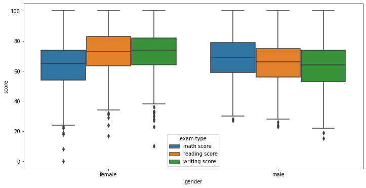
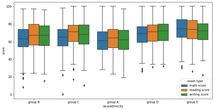
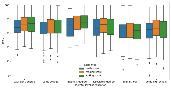
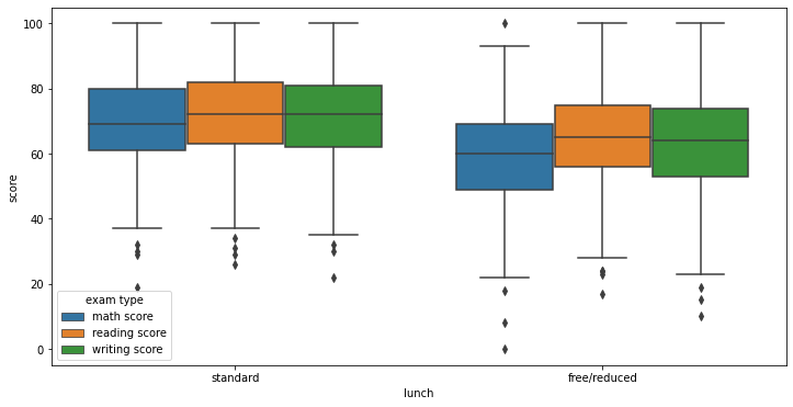
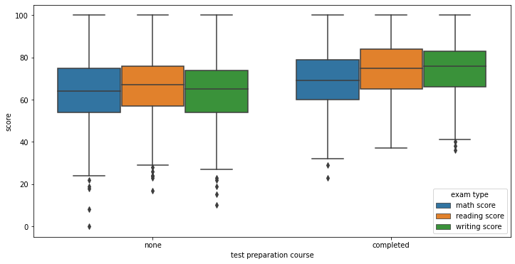
The above plots visualize the spread of scores for each subject across each variable. As we can see here even though we observed different means there is a lot of overlap. This suggests that given you may have features that should reduce your score you can over come it.
However if you have every thing against you or everything for you this does seem to have a clear indication of performance. below we can see results of the students with the worst set of features vs those with the best. Here you can see a clear separation
df_worst = df[(df['gender']=='male')&(df['race/ethnicity']=='group A')&(df['parental level of education']=='high school')&(df['lunch']=='free/reduced')&(df['test preparation course']=='none')]
df_best = df[(df['gender']=='female')&(df['race/ethnicity']=='group E')&(df['parental level of education']=='master\'s degree')&(df['lunch']=='standard')&(df['test preparation course']=='completed')]
df_worst
| gender | race/ethnicity | parental level of education | lunch | test preparation course | math score | reading score | writing score | |
|---|---|---|---|---|---|---|---|---|
| 395 | male | group A | high school | free/reduced | none | 48 | 45 | 41 |
| 688 | male | group A | high school | free/reduced | none | 53 | 58 | 44 |
| 811 | male | group A | high school | free/reduced | none | 45 | 47 | 49 |
df_best
| gender | race/ethnicity | parental level of education | lunch | test preparation course | math score | reading score | writing score | |
|---|---|---|---|---|---|---|---|---|
| 685 | female | group E | master's degree | standard | completed | 94 | 99 | 100 |
| 995 | female | group E | master's degree | standard | completed | 88 | 99 | 95 |
Its worth noting that a lot of these features are out of the students control. In fact the only two that a prospective student can control is their lunch and test course preparation. So lets look at the combined effect of these in some plots and groupings and see how the separate a students performance
df.groupby(['lunch', 'test preparation course']).agg(['mean'])
| math score | reading score | writing score | ||
|---|---|---|---|---|
| mean | mean | mean | ||
| lunch | test preparation course | |||
| free/reduced | completed | 63.045802 | 69.870229 | 70.351145 |
| none | 56.508929 | 61.602679 | 58.736607 | |
| standard | completed | 73.533040 | 76.215859 | 76.766520 |
| none | 68.133971 | 69.177033 | 67.595694 |
pd.options.mode.chained_assignment = None

df_melt_fn = df_melt[(df_melt['lunch']=='free/reduced')&(df_melt['test preparation course']=='none')]
df_melt_sc = df_melt[(df_melt['lunch']=='standard')&(df_melt['test preparation course']=='completed')]

df_melt_fn.loc[:,'prep and lunch']='neither'
df_melt_sc.loc[:,'prep and lunch']='both'

df_melt2 = df_melt_fn.append(df_melt_sc, ignore_index=True)
plot = sns.boxplot(x='prep and lunch',hue='exam type', y='score', data=df_melt2)
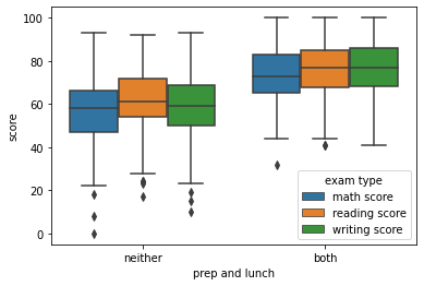
As can be seen from the above plot people who have improved there lunch and taken an test preparation course have seen better results according to the data set.
Build a Pipeline and Model
Now we have done our EDA showing how all of the feature variables separate performance of students lets build a model to predict performance of a student in the maths subject.
First we need to make a test train split
from sklearn.model_selection import train_test_split
target = ['math score']
X, y = df[features], df[target]

X_train, X_test, y_train, y_test = train_test_split(X, y, test_size=0.3, random_state=69)

print(X_train.shape, X_test.shape, y_train.shape, y_test.shape)
(700, 5) (300, 5) (700, 1) (300, 1)
from sklearn.pipeline import Pipeline
from sklearn.preprocessing import OneHotEncoder
from sklearn.model_selection import GridSearchCV
from sklearn.ensemble import RandomForestRegressor

pipe = Pipeline([('hot', OneHotEncoder()), ('rf', RandomForestRegressor())])

param_grid = {
    "rf__n_estimators": [300, 500, 1000],
    "rf__criterion": ['absolute_error'],
    "rf__max_depth": [None,2,3,4],
}


cv = GridSearchCV(pipe, param_grid, n_jobs=-1, cv=3, verbose=10, scoring='neg_mean_absolute_error')
cv.fit(X_train, y_train.values.ravel())

print('The best score was: ', cv.best_score_, ' with the following parameters.\n')
print(cv.best_params_)
Fitting 3 folds for each of 12 candidates, totalling 36 fits
The best score was:  -11.100714033886424  with the following parameters.

{'rf__criterion': 'absolute_error', 'rf__max_depth': 4, 'rf__n_estimators': 300}
import numpy as np
from sklearn.metrics import mean_absolute_error
preds = cv.best_estimator_.predict(X_test)
#print(np.sqrt(np.mean(np.power(preds - y_test.values,2))))
mean_absolute_error(preds,y_test)
10.68906111111111
Here we can see our model gets a absolute error of 11.1 and 10.69 on train and test respectively. This means our model was on average predicting a score around 11 percentage points away from our true score.
Lets change our regression problem into a classification problem by changing scores to grades following the below schema
| Grade | Score |
|---|---|
| A | 90-100 |
| B | 70-89 |
| C | 50-69 |
| D | 40-49 |
| F | 0-39 |
In python we can very easily build a function to do this.
def grade_conv(x):
  if x>=90:
    return 'A'
  elif x>=70:
    return 'B'
  elif x>=50:
    return 'C'
  elif x>=40:
    return 'D'
  else:
    return 'F'
apply the function to our y_test and y_train
y_train_grade = y_train[target[0]].apply(lambda x: grade_conv(x))
y_test_grade = y_test[target[0]].apply(lambda x: grade_conv(x))
Below we build a random forest classifier and run a grid search cross validation to train our hyper parameters.
from sklearn.ensemble import RandomForestClassifier

pipe = Pipeline([('hot', OneHotEncoder()), ('rf', RandomForestClassifier())])

param_grid = {
    "rf__n_estimators": [300, 500, 700],
    "rf__criterion": ['gini', 'entropy'],
    "rf__max_depth": [None,2,3,4],
    "rf__max_features": ['auto','sqrt','log2',None]
}


cv = GridSearchCV(pipe, param_grid, n_jobs=-1, cv=3, verbose=10)
cv.fit(X_train, y_train_grade)

print('The best score was: ', cv.best_score_, ' with the following parameters.\n')
print(cv.best_params_)
Fitting 3 folds for each of 96 candidates, totalling 288 fits
The best score was:  0.49283469669735763  with the following parameters.

{'rf__criterion': 'gini', 'rf__max_depth': 2, 'rf__max_features': 'sqrt', 'rf__n_estimators': 700}
from sklearn.metrics import accuracy_score
preds = cv.best_estimator_.predict(X_test)
accuracy_score(preds,y_test_grade)
0.53
here we get an accuracy score of 53% which is only slightly better than guessing the most common class the C grade
Conclusions
Where the random forest model did not perform as well as hoped we can certainly look to investigate more predictive models in the future.
As for insights to the data they are summarised by:
- Women score on average higher than men in every subject excluding maths
- Group A perform poorly where Group E are on average score the highest
- The higher your parents education is the higher yours should be.
- Students who received a free/reduced lunch performed worse than those who received a standard lunch.
- Students who did a test preparation course performed better in exams.
We saw these by looking at some bar-plots using seaborn along with some groupby in pandas
If you would like to check out this notebook yourself please take a look at my github